SensoŁapki Visual Identity
A warm, joyful visual identity for SensoŁapki - a sensory toddler club that supports children's development through sensory play.
A warm, joyful visual identity for SensoŁapki - a sensory toddler club that supports children's development through sensory play.
The Brief
SensoŁapki needed an identity that communicates care, safety and joy, centred on sensory activities - instantly readable to a parent searching for a toddler club.
Where the name, the audience and the feeling met.
SensoŁapki ("senso-paws") is a club for the youngest children, built around sensory activities that support early development — touch, movement, sound and play. The audience is parents of toddlers looking for a safe, nurturing place to spend time together.
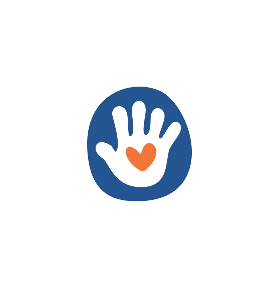
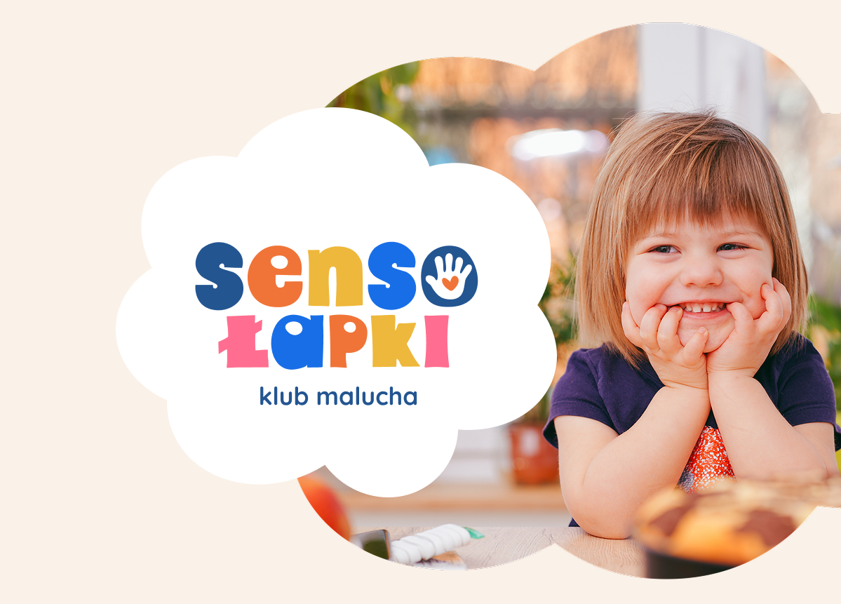
The name joins "senso" (the senses) with "łapki" (little paws/hands) — so the hand became the heart of the mark. A small palm holding a heart signals care and the tactile, hands-on nature of every activity.

Primary logo and signet — full-color versions on the brand cream background.
A joyful, high-energy palette anchored by a trustworthy navy — bright enough for children, calm enough for parents.
A soft, rounded display for the brand voice, paired with a clean, legible sans for everything else.
Quicksand
aą bć dę fg hi jk lł mn oó • 0123456789
Lato
aą bć dę fg hi jk lł mn oó • 0123456789
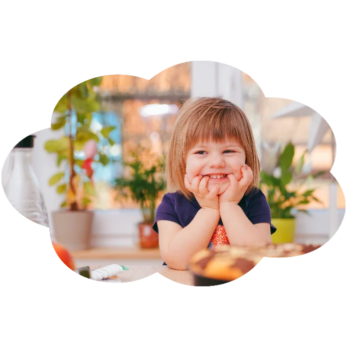
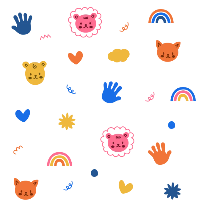
The supporting kit — the palm-and-heart symbol, the cloud shape and playful illustrations that extend the brand.
Palm & heart symbol
Cloud container shape
Illustrations & icons
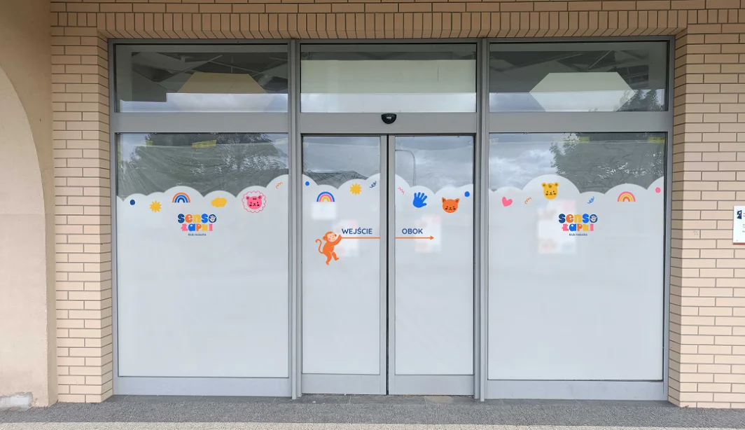
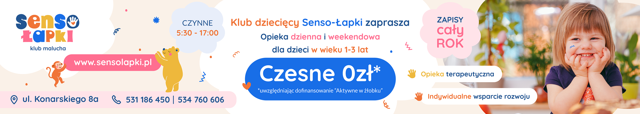
The identity in the wild — across the materials a toddler club actually uses every day.
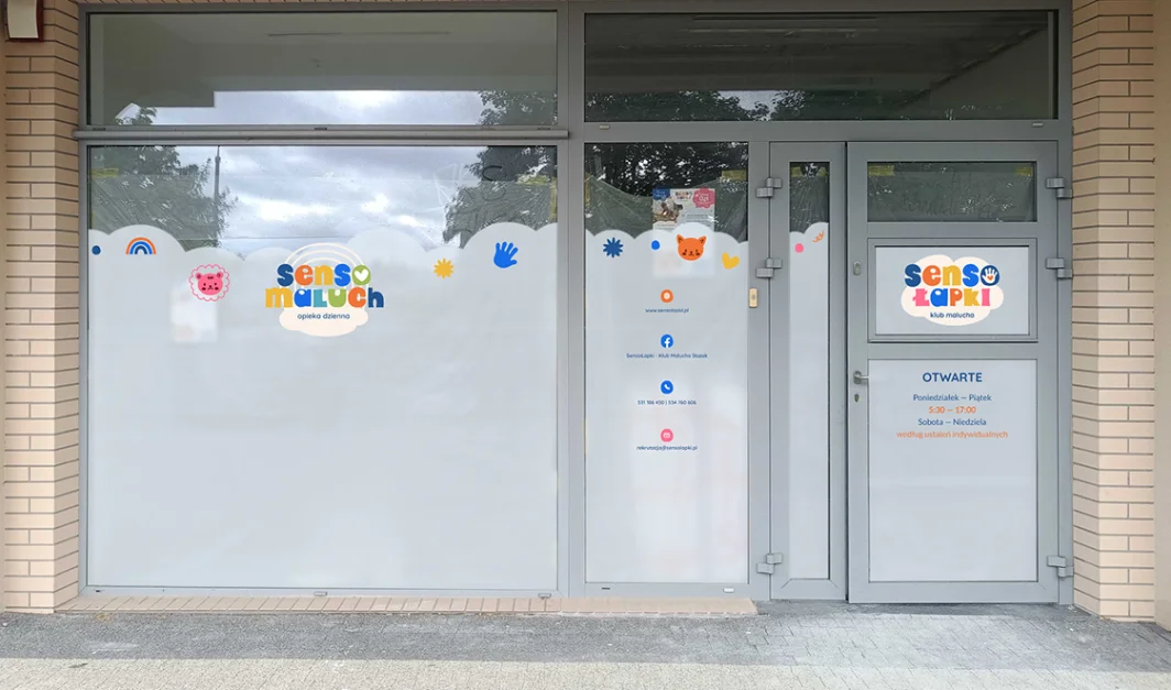
Window graphics
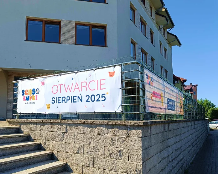
Banners
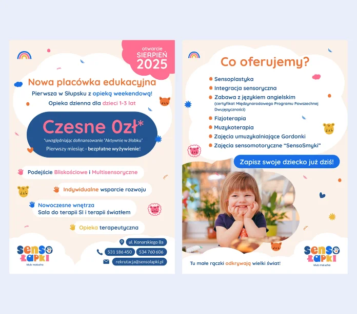
Flyers
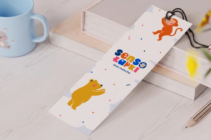
Bookmarks & stickers